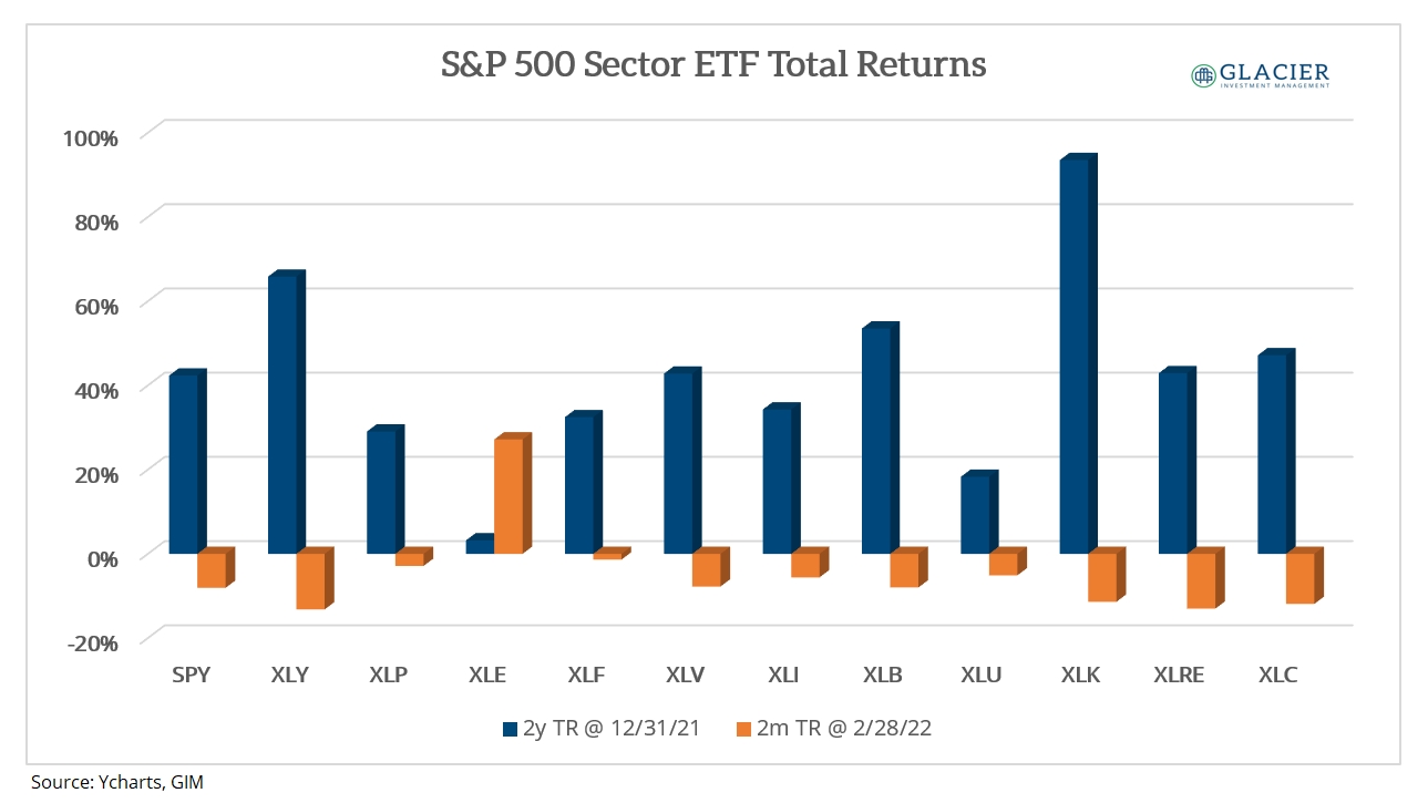
Jesse Felder in his weekly blog published the chart below from Callum Thomas last week.
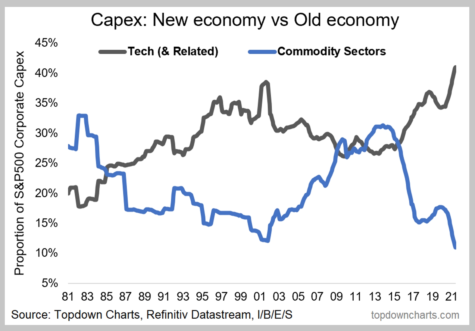
I’m not going to regurgitate what Jesse wrote. You can read his post at the link above (recommended). I’m posting it here because the visual is so dramatic. There’s nothing to say the trend will reverse like it did in the 2000s. However, it is worth considering what might happen if the trend were to reverse for any reason.
Stock Performance
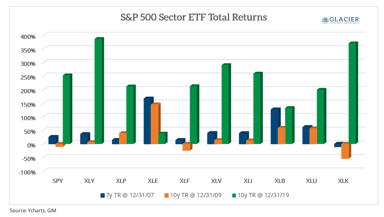
I wanted to see for myself how the various sectors within the S&P 500 performed during the 2000s and during the 2010s. In the chart below, you can see total returns for the S&P 500 sector ETFs that existed at the time for three time periods:
- The seven years ending 12/31/2007;
- The 10 years ending 12/31/2009;
- The 10 years ending 12/31/2019.
I selected 12/31/2007 to show what performance looked like before the Great Financial Crisis (“GFC”).

2000s
Interestingly, Energy was the big outperformer during the 2000s for both time periods evaluated. Materials were also a big outperformer prior to the GFC but gave up a lot in the ensuing recession. Not surprisingly, Utilities held their ground very well. Technology was the worst performing sector during the decade.
2010s
During the 2010s, a large reversal occurred with Consumer Discretionary (likely largely driven by Amazon) and Technology being the big outperformers. Importantly, Energy was the worst performing sector during the 2010s after being the best performer during the 2000s.
Reversal
If the trend in the first chart were to reverse, then I suspect Energy and Materials would outperform while Technology and Consumer Discretionary would probably underperform.
This is an overly simplified mean reversion assumption I’m making that may never happen. However, there appears to be a stark relationship between CAPEX spending trends and S&P 500 sector performance.
The important question to consider is whether the commodity CAPEX trend will reverse with the current emphasis on eliminating fossil fuels. Regardless, trends don’t last forever.
